BRICK BY BRICK
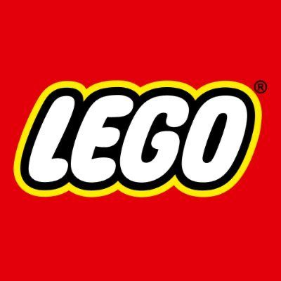
Decoding LEGO Logo
Lego was crowned the largest toy company just a year ago, in 2021.
After being in operation for more than half a century, Lego has become one of the most prominent and popular toy makers in the world.
Here we have shared the logo analysis for the Lego brand.
Follow us for more tips on how to elevate your brand and logo in the upcoming posts and blogs!
1. Huge Turnover/Quantity Selling:
The prominent use of red in the LEGO logo represents the company’s success and massive sales volume. It signifies their ability to generate high turnovers and capture a significant market share.
2. Confidence and Smartness in Business:
The inclusion of yellow portrays the LEGO brand as confident, dynamic, and smart in its business practices. It symbolizes optimism, creativity, and innovation, which are key characteristics associated with LEGO.
3. Expertise and Premiumness:
The black color in the logo represents LEGO’s expertise and premium position in the toy industry. It suggests the brand’s commitment to quality, craftsmanship, and excellence, making LEGO products highly valued and sought after.
4. Flexibility and Inclusion:
The white color in the logo encapsulates the essence of LEGO’s versatile and inclusive product range. It signifies the brand’s ability to accommodate various shapes, sizes, and types of LEGO bricks, allowing users to create anything their imagination desires.
5. Good Relationships with Clients:
The slight tilt in the font of the LEGO logo signifies the brand’s positive and friendly relationship with its clients. It implies a sense of approachability, openness, and willingness to engage, fostering strong connections between LEGO and its customers.
6. Longevity and Pleasure:
The bold and large letters used in the logo convey a sense of durability, longevity and impact. They suggest that LEGO products are built to last, providing ongoing enjoyment and pleasure to users, encouraging loyalty and repeat purchases.
7. Technical Precision:
The square shape of the LEGO logo’s design elements symbolizes technical precision and accuracy. It reflects the meticulous craftsmanship and attention to detail associated with LEGO’s construction toys, highlighting the brand’s commitment to quality.
8. Unity and Collaboration:
The intertwining of the letters in the LEGO logo represents unity and collaboration, reinforcing the brand’s emphasis on creativity, teamwork and cooperation. It reflects the shared experience of building and playing with LEGO bricks.
9. Structural Integrity:
The use of geometric styling in the logo design emphasizes LEGO’s focus on structural integrity and stability. It suggests that LEGO products are designed to fit together securely, enabling users to build robust and stable creations.
10. Primary Colors giving Simplicity and Universality:
The primary colors, including red, yellow and white, chosen for the LEGO logo, represent simplicity and universality. They emphasize LEGO’s appeal to a wide range of age groups and its ability to transcend cultural boundaries.
11. Negative Space giving Imagination and Possibilities :
The clever use of negative space between the LEGO letters creates the illusion of additional shapes. This symbolizes the limitless possibilities and imagination that LEGO encourages in its users, promoting creative thinking and problem-solving skills.
12. Minimalistic Design showing Timelessness and Modernity:
The minimalistic design of the LEGO logo signifies timelessness and modernity. It suggests that LEGO has adapted its brand identity to be contemporary, while still maintaining its core values and recognized branding elements.
13. Playful Font connects with Childhood and Fun:
The font used in the LEGO logo has a playful and childlike quality, evoking a sense of nostalgia and fun associated with childhood play. It reflects the brand’s focus on creativity, imaginative play, and the joy of building.
14. Balanced Composition of Harmony and Structure:
The logo’s composition conveys a sense of balance, harmony, and visual structure. It represents LEGO’s commitment to design excellence and aesthetic appeal, further reinforcing its premium brand positioning.
15. International Appeal giving Global Reach:
The LEGO logo’s design and symbolism have global appeal. It is easily recognizable across cultures and languages, underscoring LEGO’s worldwide presence and its success in capturing the imagination of children and adults worldwide.
16. Sustainable Messaging:
By featuring the primary colors of red, yellow and black in its logo, LEGO subtly conveys environmental responsibility. Red represents innovation and commitment to sustainable practices, yellow symbolizes renewable energy and black signifies the brand’s efforts towards achieving carbon neutrality.
17. Community Building:
The LEGO logo’s bold, block-like letters reflect the importance of community and social interaction in LEGO’s philosophy. It signifies the collaborative nature of LEGO play and the brand’s dedication to creating a supportive and inclusive community of builders and enthusiasts.
18. Emotional Resonance :
Inspired by the concept of “Playful Learning,” the LEGO logo’s design evokes emotions associated with joy, curiosity, and learning. It symbolizes the transformative power of play in fostering creativity, problem-solving, and cognitive development in individuals of all ages.
19.Stability and Precision :
The square shape here inherently represents stability, balance and structural integrity. By incorporating a square shape in its logo, LEGO signifies its commitment to engineering excellence and the precise construction of its building blocks.
It emphasizes the brand’s focus on creating products that can be assembled securely and remain structurally sound during play.
20. Modular System :
This square shape aligns with LEGO’s modular building system, which forms the foundation of its products. LEGO bricks are designed to connect easily and systematically, enabling users to build and create various structures. The square shape in the logo reflects the interconnectivity that LEGO offers, promoting a seamless building experience.
21. Technical Expertise :
The choice of a square shape in the LEGO logo also communicates the brand’s technical expertise in designing and manufacturing toys. It suggests the attention to detail and rigorous engineering standards followed by the company, further enhancing LEGO’s reputation as a leading player in the toy industry.

#LegoLogo #LogoAnalysis #BrandIdentity #LogoDesign #GraphicDesign #LegoBrick #LogoInspiration #LogoStudy #DesignAnalysis #LogoCritique #LegoArt #LogoExploration #LogoEvolution #BrandAnalysis #Quantumlogodesign #LogoDeconstructed #LogoResearch #VisualIdentity #LogoHistory #LegoFan
